CSS Properties
Table of Contents
align-items:box-sizing:margin:position:text-size-adjust:‑webkit‑text‑size‑adjust:float: right;vsmargin-left: auto;text-align: center;vsmargin: auto;- Flexbox
- Grid
- Links
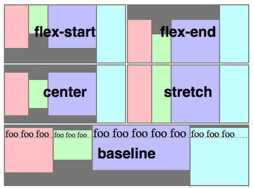
align-items: reference
- a sub-property of
flexbox
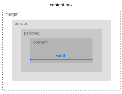
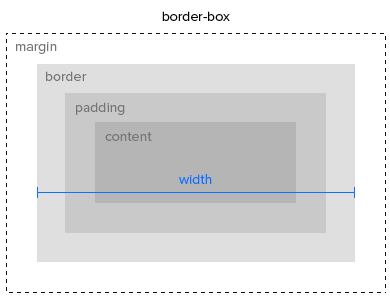
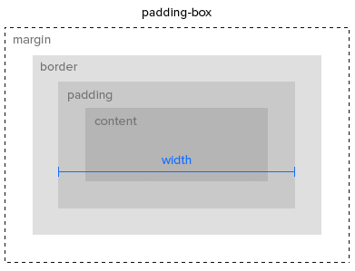
box-sizing: reference
margin: reference
margin: <top> <right> <bottom> <left>;
margin: <top,bottom> <right,left>;
margin: <all>;
margin: auto; /* set the margin to horizontally center the element */
position: reference
text-size-adjust: reference
‑webkit‑text‑size‑adjust: reference
Mobile Safari on iPhone will automatically increase the size of small text. When this behavior is undesirable, you can turn this feature off by ‑webkit‑text‑size‑adjust: 100%.
Don't use none instead of 100%. It will disable text resizing entirely.
/*
  The default value 'auto' makes code block inconsistent in font sizes
  on some iOS devices.
*/
-webkit-text-size-adjust: 100%;float: right; vs margin-left: auto; discussion
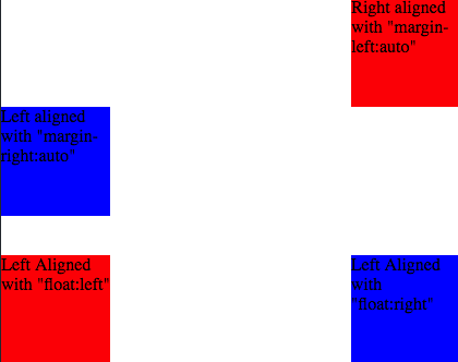
text-align: center; vs margin: auto; discussion
text-align: center;To center the content of an element ( text, images etc.) Although it's possible to center an element using
text-alignalongsidedisplay: inline;, It's not recommended.margin: auto;To center a element with a known width
Flexbox tutorial
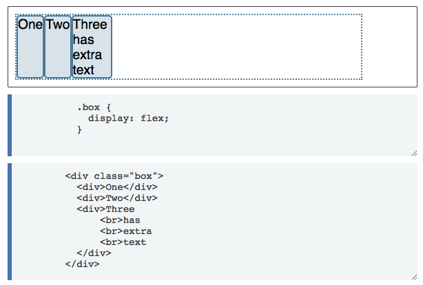
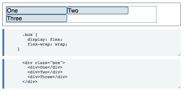
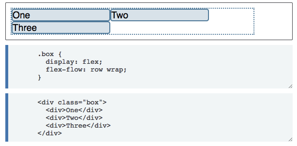
- Only each child (direct descendant) of a flex container becomes a flex item
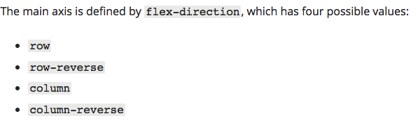
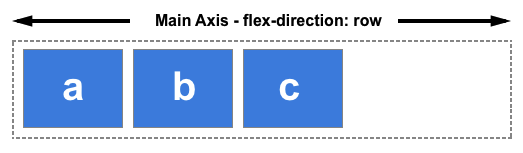
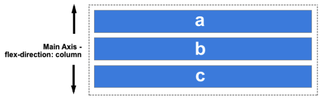
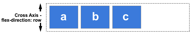
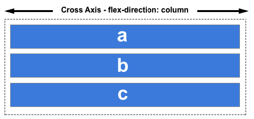
flex-flow = flex-direction + flex-wrap
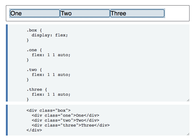
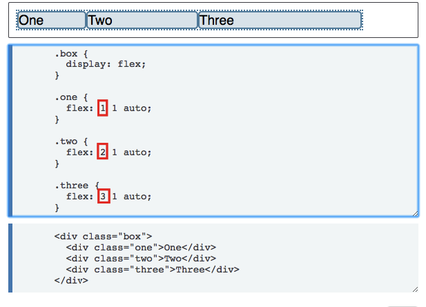
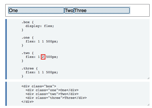
flexflex-growflex-shrinkflex-basisflex-growWhen there is some space available, items share the space based on the ratio of this value. When
flex-growis 0, so items will not grow larger than theirflex-basissize.flex-shrinkWhene there is less space than required, items shrink their spaces based on the ratio of this value
flex-basisThe default size of the item.
- https://stackoverflow.com/questions/14148162/does-the-css-flexbox-module-work-on-direct-child-elements-only
- https://developer.mozilla.org/en-US/docs/Web/CSS/CSS_Flexible_Box_Layout/Basic_Concepts_of_Flexbox
- https://developer.mozilla.org/en-US/docs/Web/CSS/CSS_Flexible_Box_Layout/Relationship_of_Flexbox_to_Other_Layout_Methods
- https://css-tricks.com/snippets/css/a-guide-to-flexbox/